

Design Improvements

Mobile-First Responsive Design
%20(16).png)
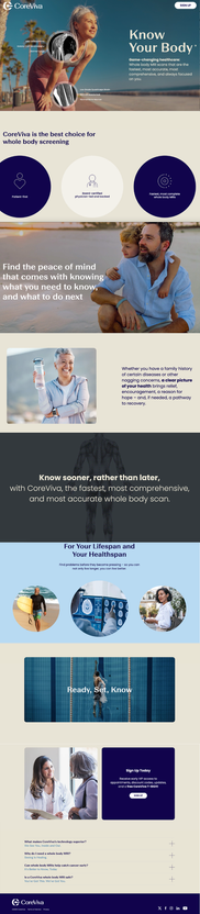
I designed each website page with a responsive, mobile-first approach so the experience would feel seamless across desktop, tablet, and mobile. The layouts were structured to prioritize clarity on smaller screens first, with simplified navigation, readable content blocks, clear calls to action, and flexible sections that scale into more immersive desktop experiences.
This ensured the website could support the full customer journey from initial mobile discovery to confident desktop conversion.
Interaction Design
One of my primary goals for the redesign was to make the website feel as modern and premium as the CoreViva patient experience itself. Rather than relying on static pages, I used thoughtful interactions and motion to guide users through the experience, communicate complex healthcare concepts, and make the website more engaging.
Bringing the Patient Experience to Life
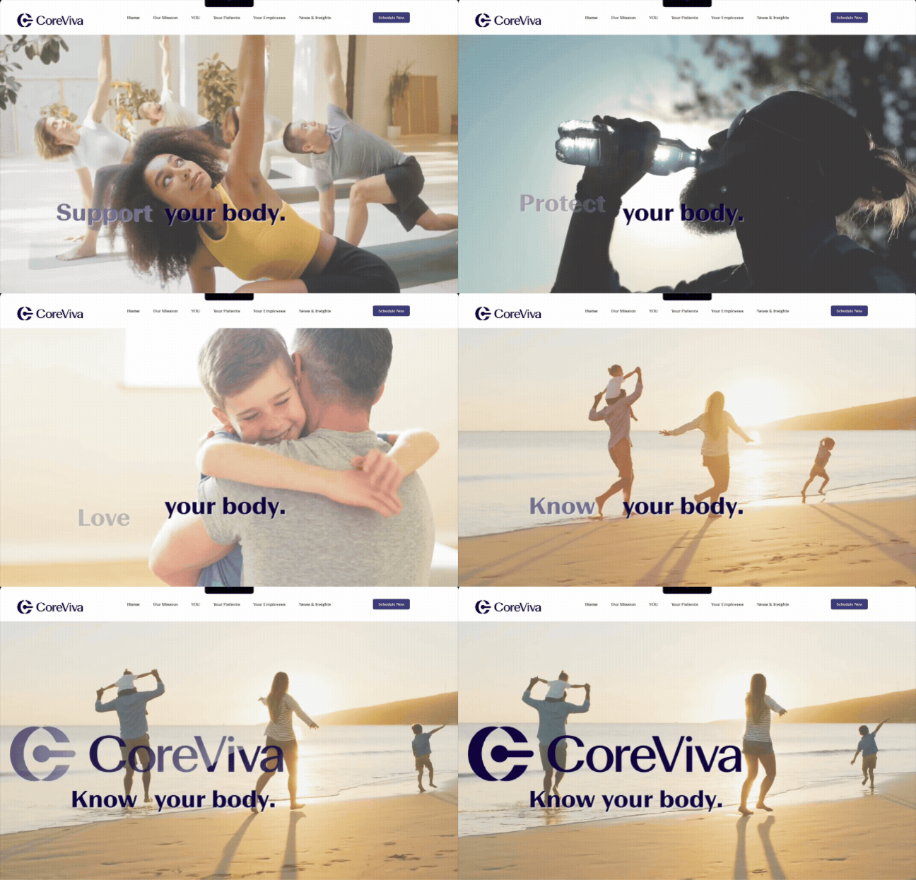
I introduced subtle animations throughout the landing page to create a more immersive experience and reinforce CoreViva's premium, patient-centered approach.
Examples include:
-
Smooth image transitions showcasing the clinic environment
-
Motion effects that guide the eye through key messaging
-
Interactive content that encourages exploration without overwhelming the user
These interactions help visitors visualize the experience before ever stepping into the clinic.
Visualizing MRI Technology
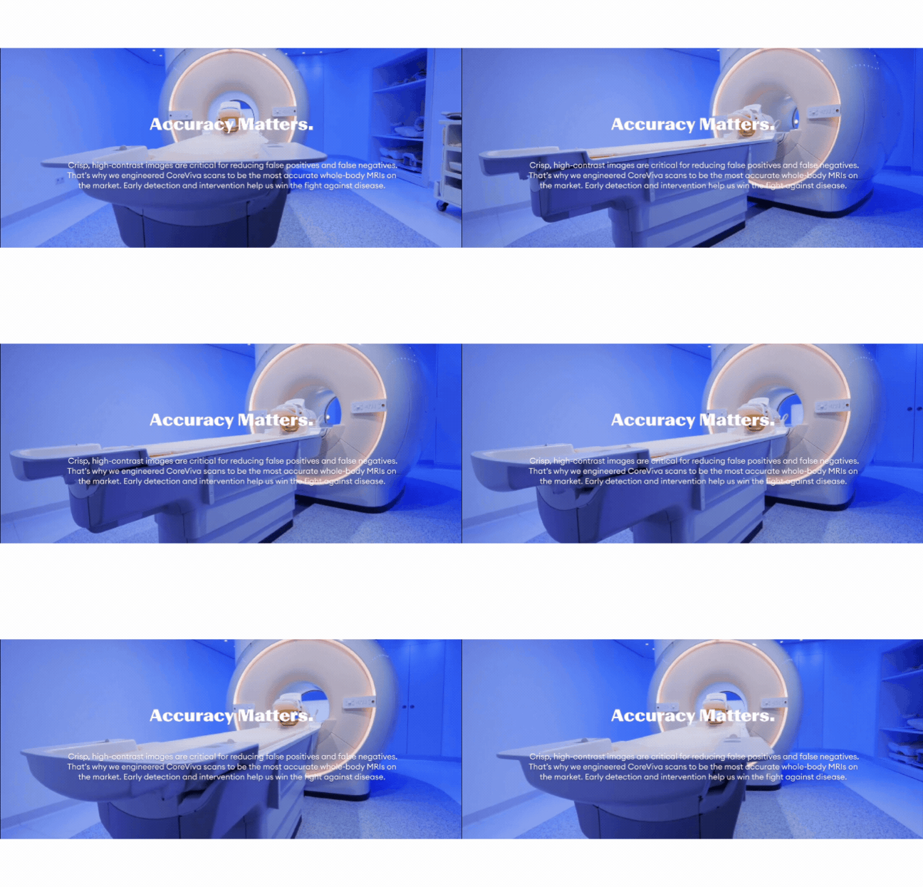
Whole-body MRI is difficult to explain through static imagery alone. To better communicate the technology, I designed interactive MRI image slicing animations that simulate how radiologists examine the body layer by layer.
This interaction transforms a highly technical concept into something intuitive and engaging, helping users better understand the scan's depth and precision.

Making the Booking Journey Feel Simple
Scheduling a preventative health scan can feel intimidating, especially for first-time patients.
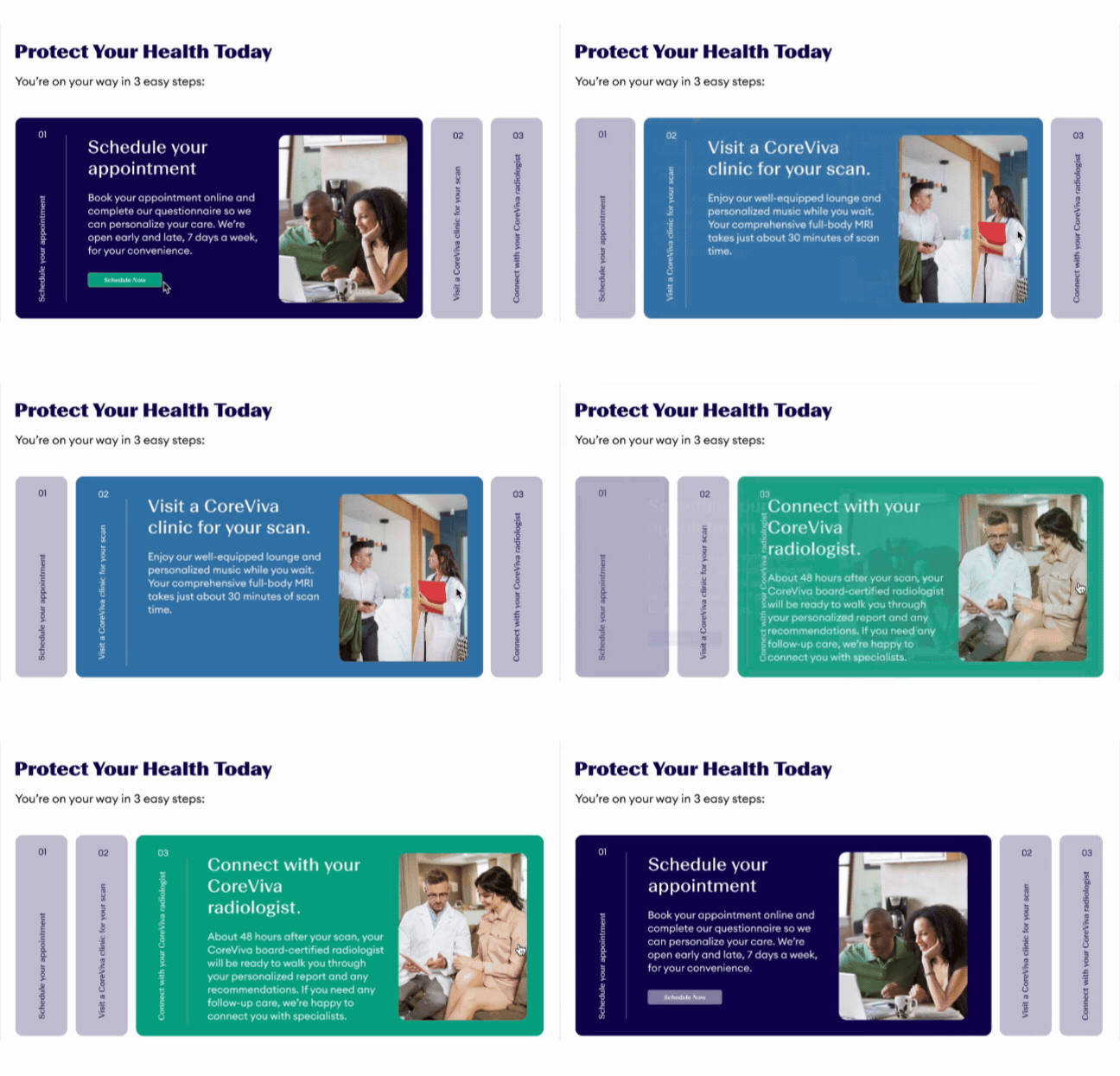
To reduce friction, I created interactive booking components that visually walk users through the appointment process. Rather than presenting information as dense blocks of text, progressive interactions break the process into manageable steps, helping users feel more confident about scheduling.
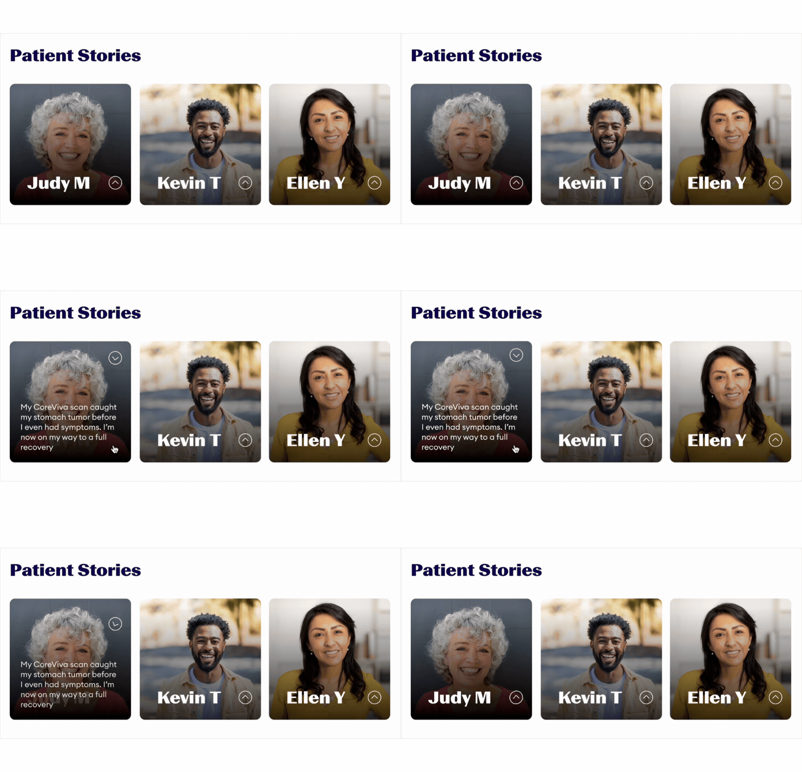
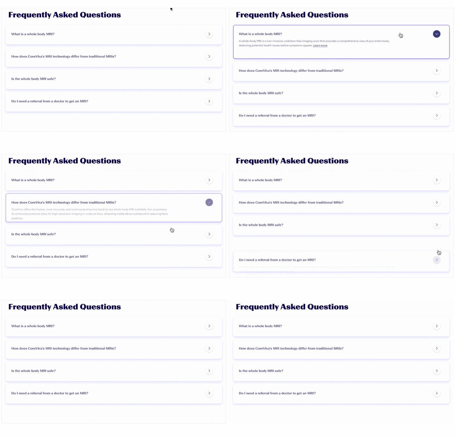
Progressive Disclosure for Educational Content
Healthcare websites often contain large amounts of information, but displaying everything at once can overwhelm visitors.
By revealing information only when users request it, the interface remains clean and approachable while still providing access to detailed answers for users who want to learn more.
Additional Website Pages
I also designed and wrote copy for additional website pages that helped visitors better understand CoreViva’s value, technology, and key differentiators. This work was informed by SEO research, competitive analysis, and user interviews, ensuring the content answered real patient questions while improving discoverability.
%20(13).png)
%20(14).png)
%20(15).png)